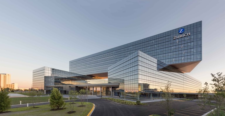
Zurich North America Headquarters
Zurich North America needed a single building to replace a scattered facility and hold nearly 3,000 people, on 40 acres of expressway frontage in Schaumburg that had once been part of the Motorola campus. The brief asked for strength and stability, the company’s own words for itself, made architectural.
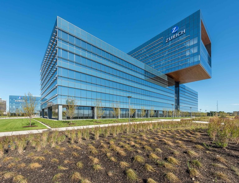
The answer was to stop laying buildings out across the site and stack them instead. Three glass bars, offset from one another, hold 783,800 square feet in a form that reads as one object from Interstate 90. The top bar rises 11 stories and cantilevers toward downtown Chicago. Certified LEED Platinum.
- Client
- Zurich North America
- City
- Schaumburg, Illinois
- Size
- 11 stories
- 783,800 sq ft total 72,820 sq m total
- 40 acres / 16.2 hectares
Exterior
A 40-acre site invites sprawl, and the conventional answer for a suburban headquarters is a low, wide plan with a center core and parking around it. That plan gives every floor the same depth, the same orientation and the same view. It was rejected here in favor of a form that had to work harder and gives back more.
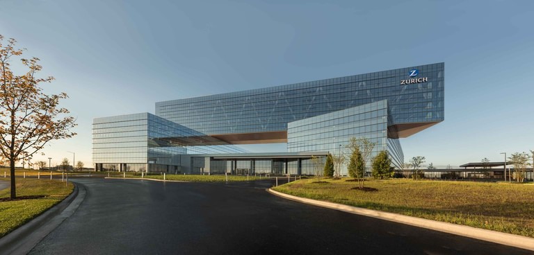
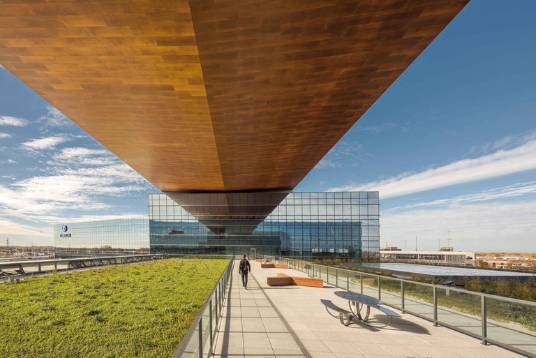
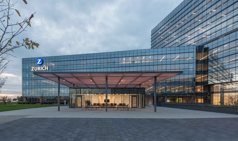
The three bars are offset in section, each one engaging a different part of the site and a different orientation. Amenities take the south and west exposures and office plates the east and north, which lowers mechanical load across the complex before a single system is sized. The arrangement also opens views of the surrounding landscape and produces the kind of programmatic flexibility a center-core building cannot. The uppermost bar carries the identity: 11 stories, cantilevered toward downtown Chicago, warm wood on its soffit, legible from the interstate at 70 miles an hour.
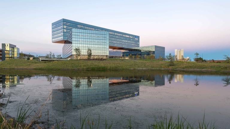
Horizontal aluminum sunshades clad the perimeter of all three bars, varying in depth according to what each facade faces. Behind them the glass runs floor to ceiling, and the office plates are shallow enough that daylight reaches across them. The building’s environmental performance is not concealed behind its surface; it is the surface.
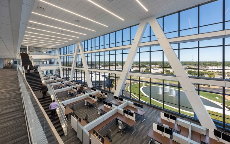
The cantilever is the part that costs something. Projecting 11 stories of occupied floor plate toward the city takes diagonal bracing, and that bracing is not hidden. It crosses the glass on the office floors as a white truss, so the people working behind it can see what holds the building out over the site.
Matthew Messner, The Architect’s NewspaperThe form of the building is clear, even at high speeds.
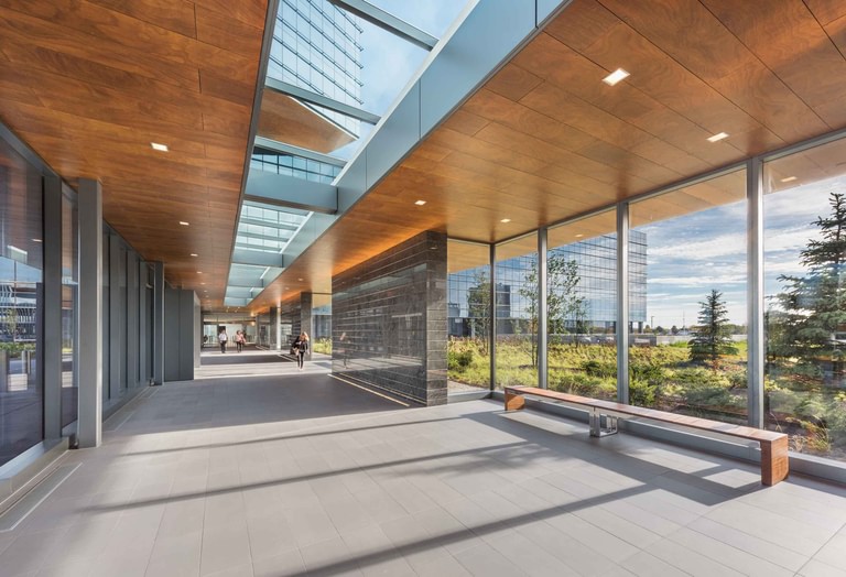
The space between the bars is as considered as the bars themselves. Multi-level plazas step down through terraced planting, sheltered from the wind by the volumes on either side but open to the sky, with the three-story double wall glazing one edge of them. Outdoor seating and direct sightlines into the dining and social spaces give the ground plane something closer to the feel of a quad than a corporate forecourt. Where the middle bar steps back, the double wall moderates the transition between a Chicago winter and a Chicago summer, and green roofs on the lower bars hold stormwater and insulate the floors underneath.
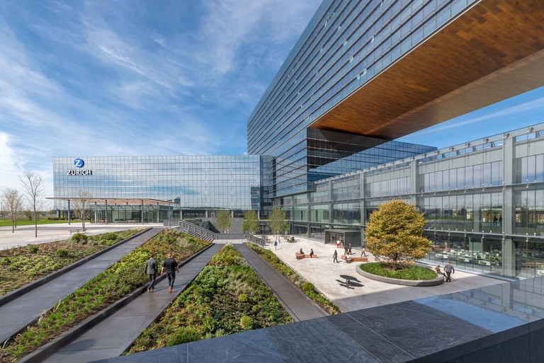
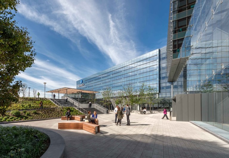
The main entry sits under a projecting canopy in the same language as the rest: steel, glass, and the warm wood that appears wherever the bars meet. Reception is visible from the forecourt. Walking trails run out from the building into restored native prairie, and the retention basins that manage stormwater double as the thing the building looks at.
Interior
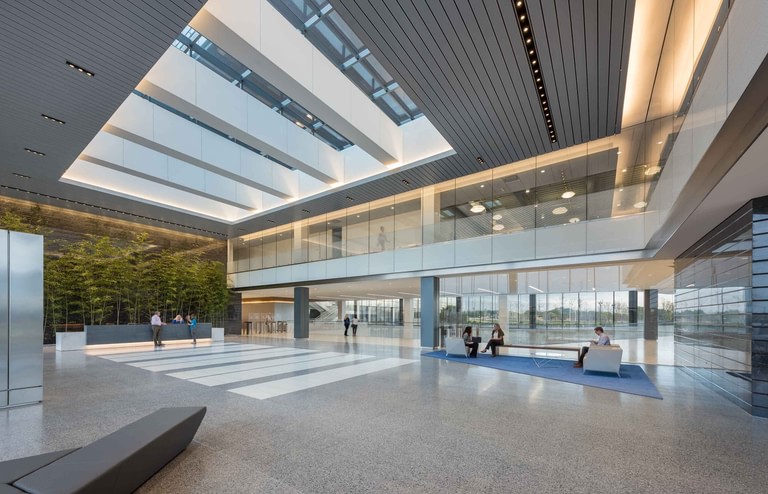
The lobby reads as an extension of the campus rather than a separation from it. It is two stories, glazed on the perimeter, with the landscape in view from anywhere in the room. Terrazzo underfoot, a linear ceiling system overhead, and a restrained gray and white palette carry the exterior’s precision indoors without repeating it.
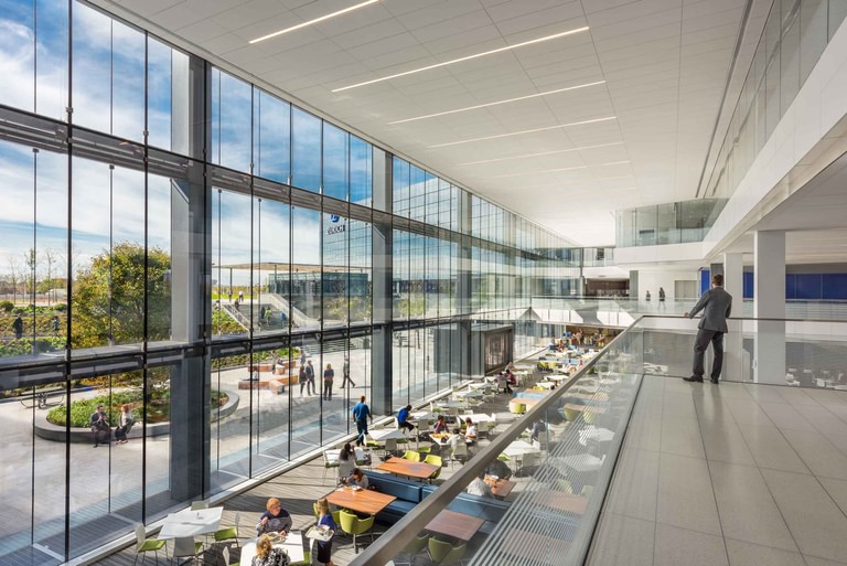
The dining hall runs the length of a full-height glass wall facing the plaza, so lunch happens with the courtyard in view and, in warm months, spilling into it. The open stair rises through the same volume, and the collaboration seating scattered along it is deliberate: circulation was treated as program, not as leftover.
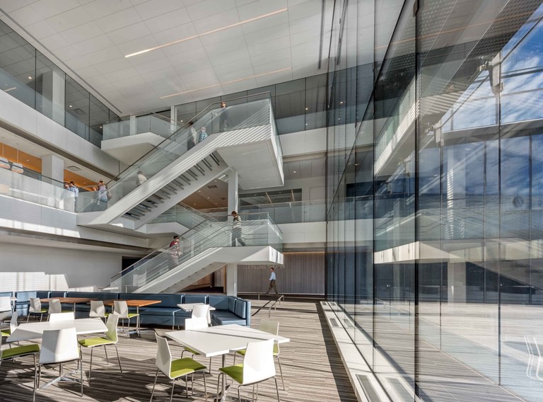
That decision came from the brief. Zurich’s previous facility separated its people; the new one was asked to put them in each other’s path. Interior design and workplace strategy were carried by CannonDesign, working to the same logic the massing set up, which is why the amenity floors and the collaboration spaces sit where the sun does.
Underneath all of it, LEED Platinum. Restored prairie and on-site retention across the 40 acres, green roofs on the lower bars, sunshades tuned per facade, a double wall doing seasonal work, and shallow daylit plates that ask less of the lights. None of that was added to the building. It is what the shape is for.